Sigortam.net Redesign
Sigortam.net platform, which is Turkey's first online insurance comparison and sales. With Sigortam.net, prices are offered and sold for many types of insurance such as Traffic, Insurance, Health and Travel.
The main purpose of the project is Sigortam.net site more modern while moving to a structure, at the same time to facilitate users' insurance price inspection, purchases and improve user experience. The targeted improvement metrics are: Bounce Rate, Page Speed, Exit Rate, Transition to Transition Steps Number of Online Sales
Research - Wireframe - User Interface - Prototype
At the beginning of the project, we came together as product managers, project owners and designers, and discussed the scope, purpose and expectations of redesign. Afterwards, we examined the competitors and discussed Sigortam.net problems and the innovations to be applied.
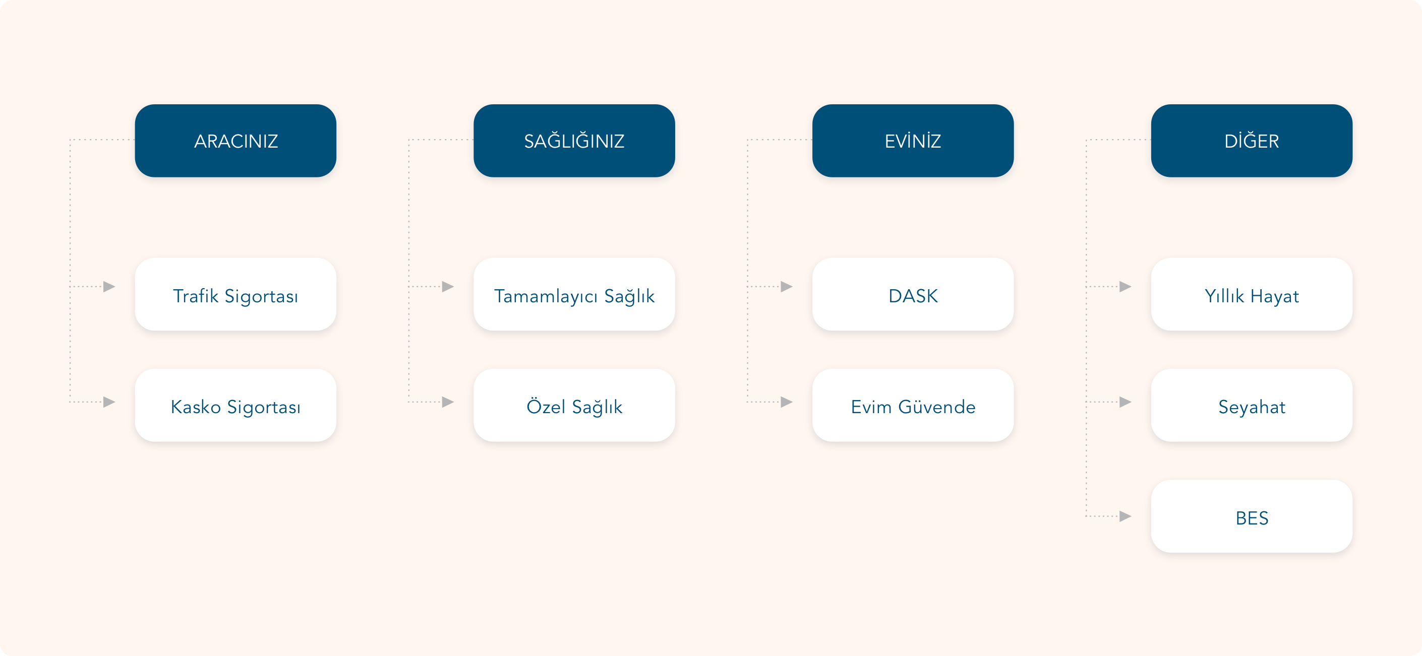
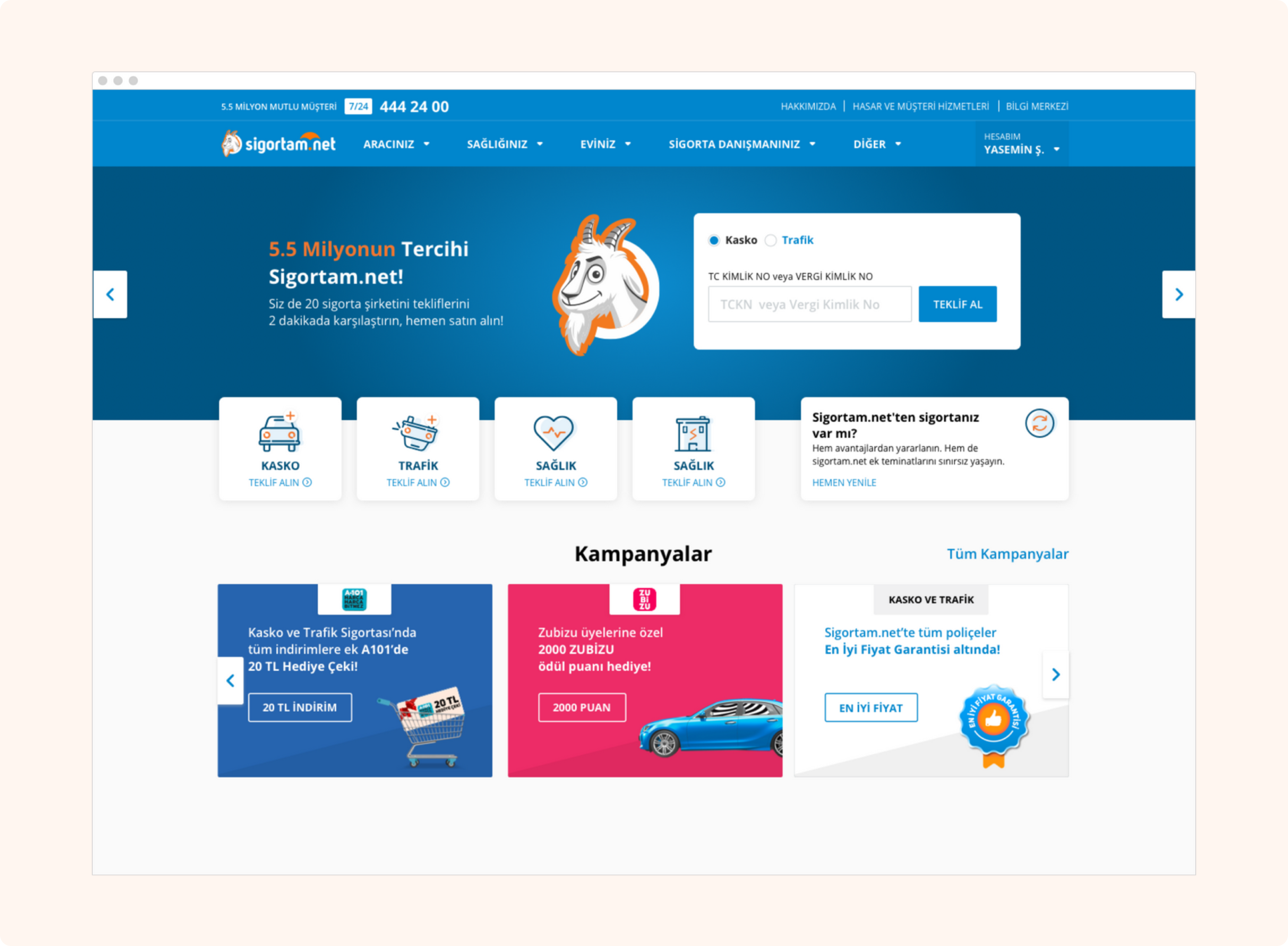
In the information architecture of the site, the categories were not clear and users were having trouble finding what they were looking for. Users wanted to get insurance for their cars, homes and other needs.
We have reduced the number of categories by classifying these needs.We also named the categories phonetically using a friendly and close language.
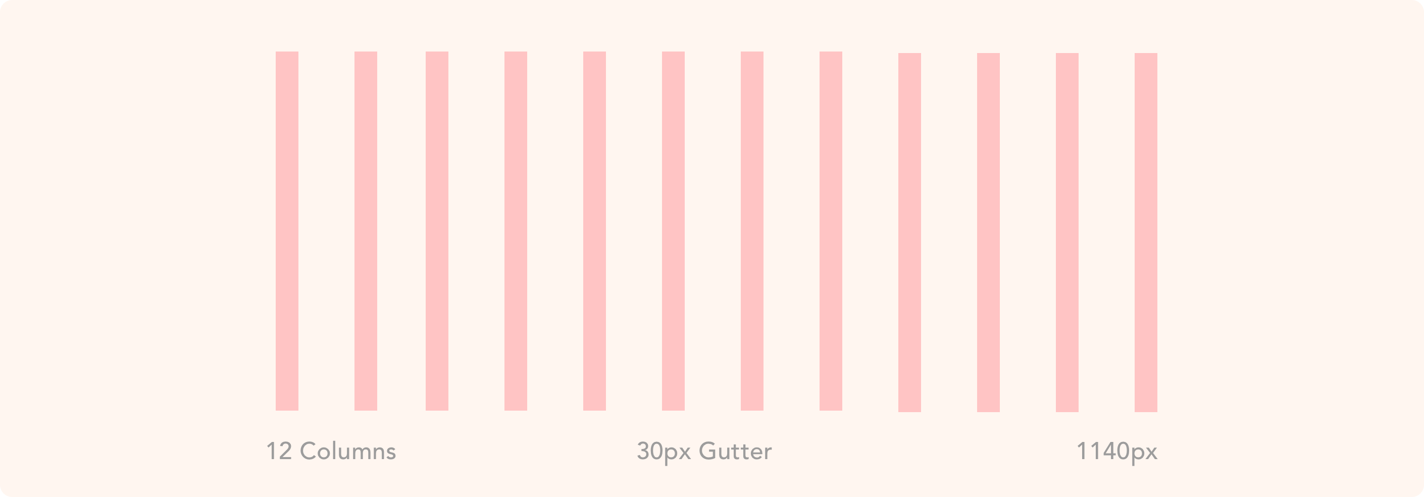
During the design, I used the Bootstrap Framework for desktop, tablet and mobile. I used the 12 column grid structure for desktop and tablet and 4 column grid for mobile. In the structure of the whole site, I have enabled this column to be advanced and customized according to the page.
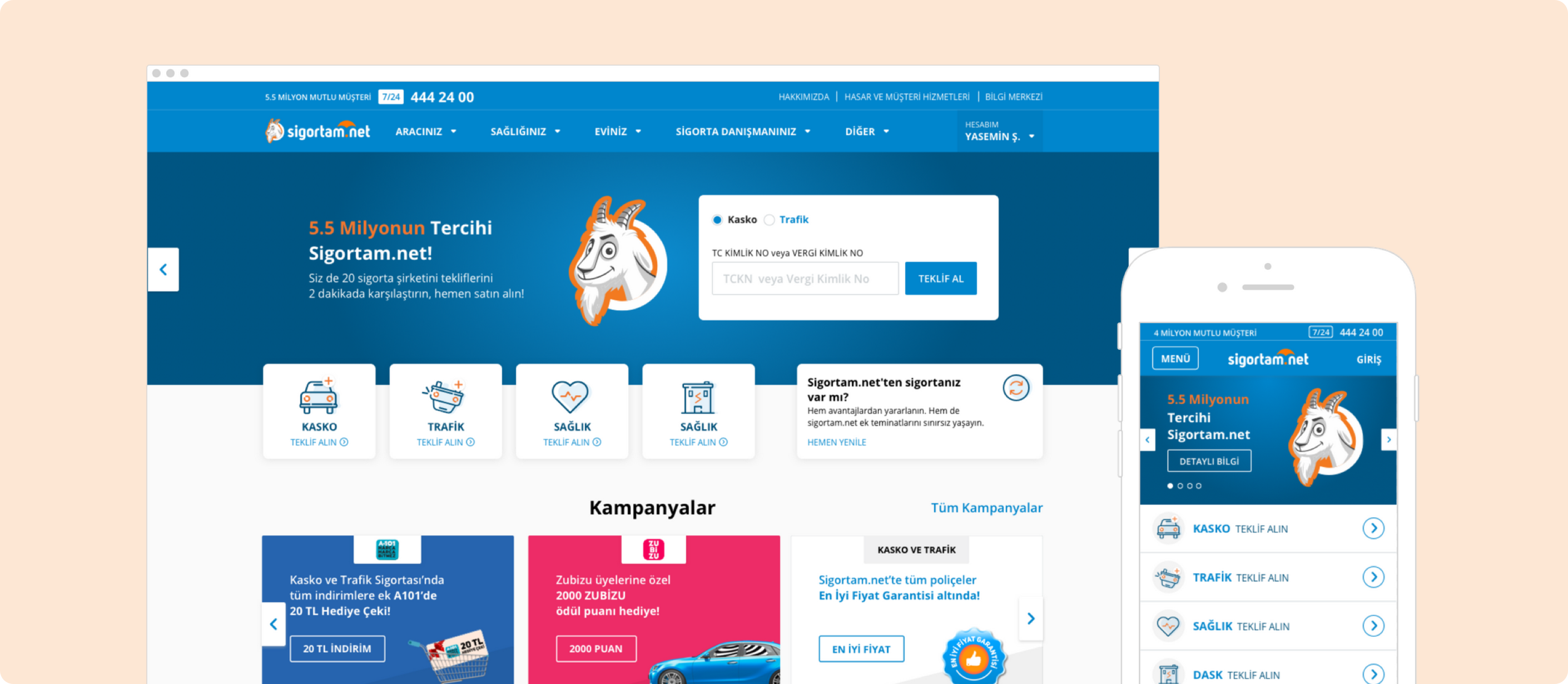
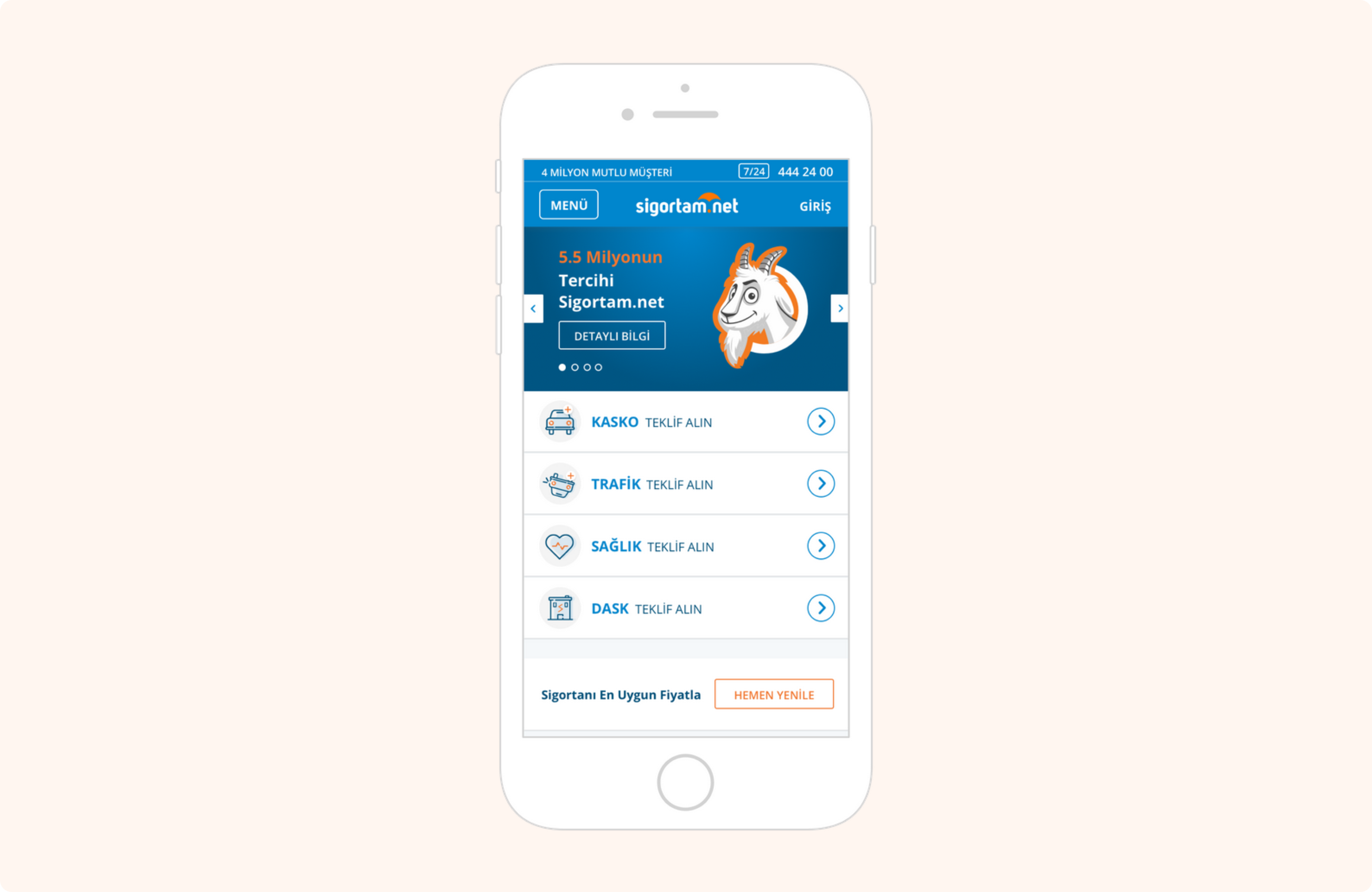
Users can get insurance offers, see campaigns, renew their insurance and get information about Sigortam.net through the homepage. Slider was used as a tool to show the latest news on the product, promote the brand, and facilitate the transition to conversion steps.
There are campaigns in the center of Sigortam.net. Therefore, the campaign features were used in the first fold. By standardizing the campaigns, all the layouts were made consistent. This consistency continued in social media and brand communication.
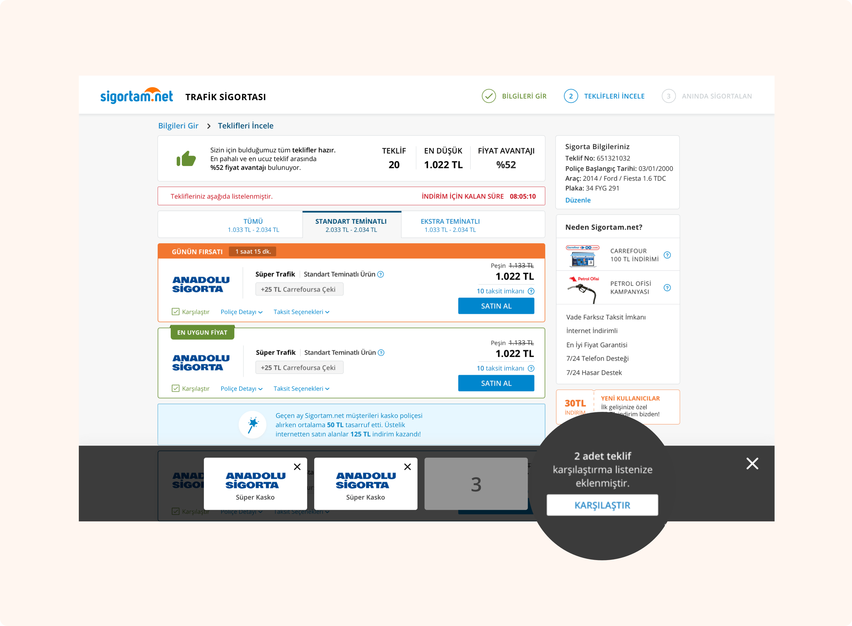
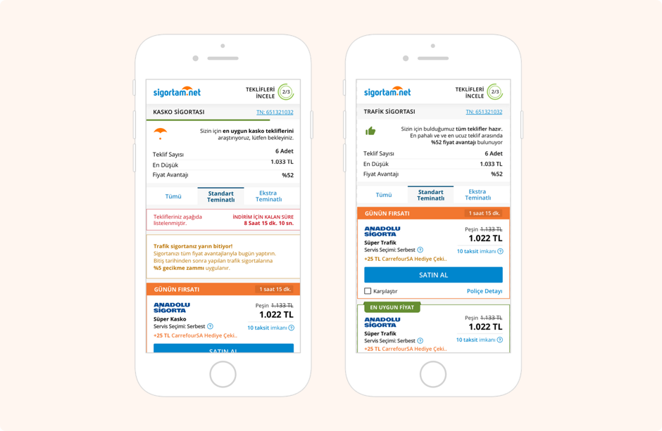
On the listing page, users can see their campaigns and insurance offers. It can proceed to the purchase step by making comparison between the products.
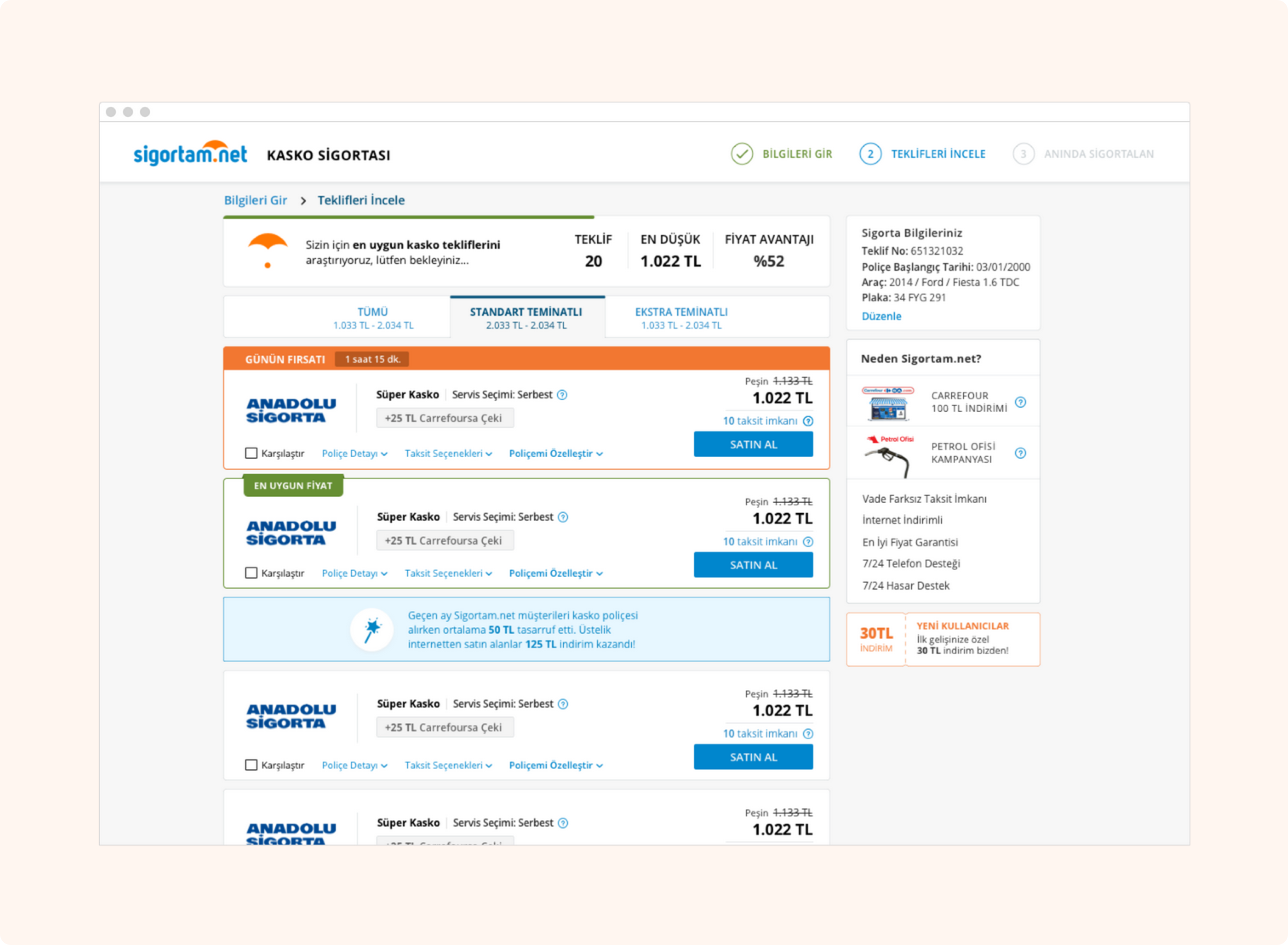
In the previous version of the site, it had a problematic structure in terms of product card height and the architecture of the information in it. Price and tally display areas caused an unclear image pollution.
The height of the new product cards has been reduced so that the user can see more offers on the first fold and reach the most suitable.
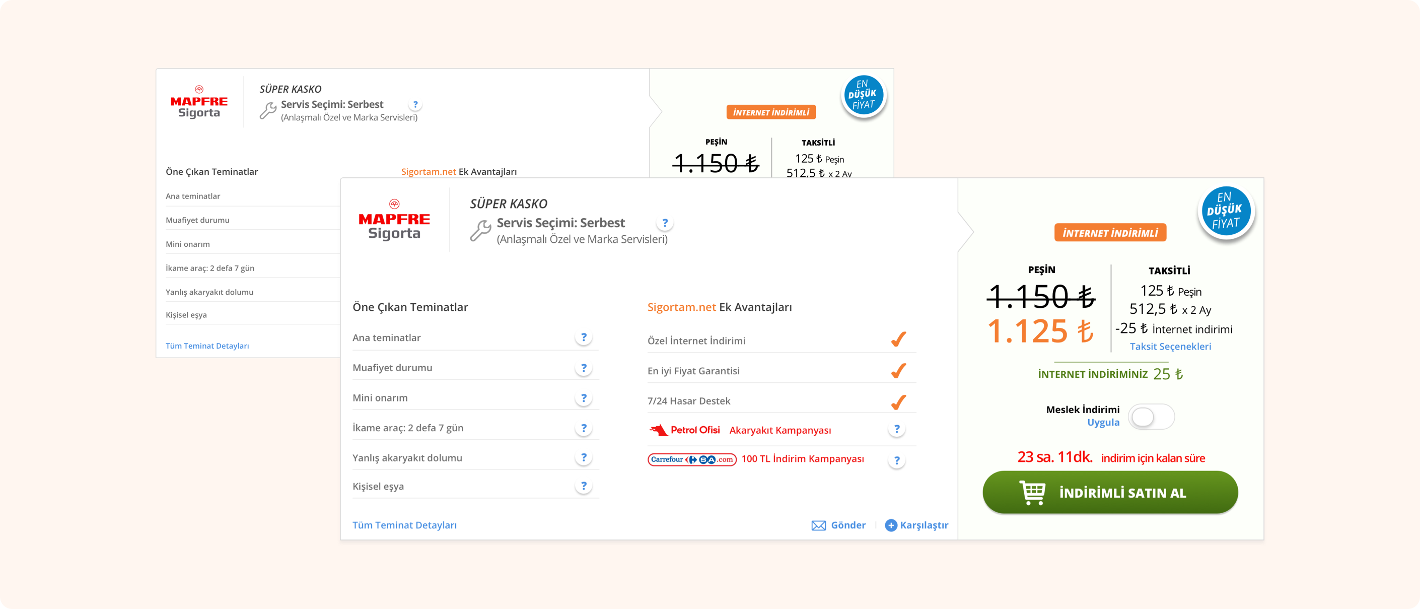
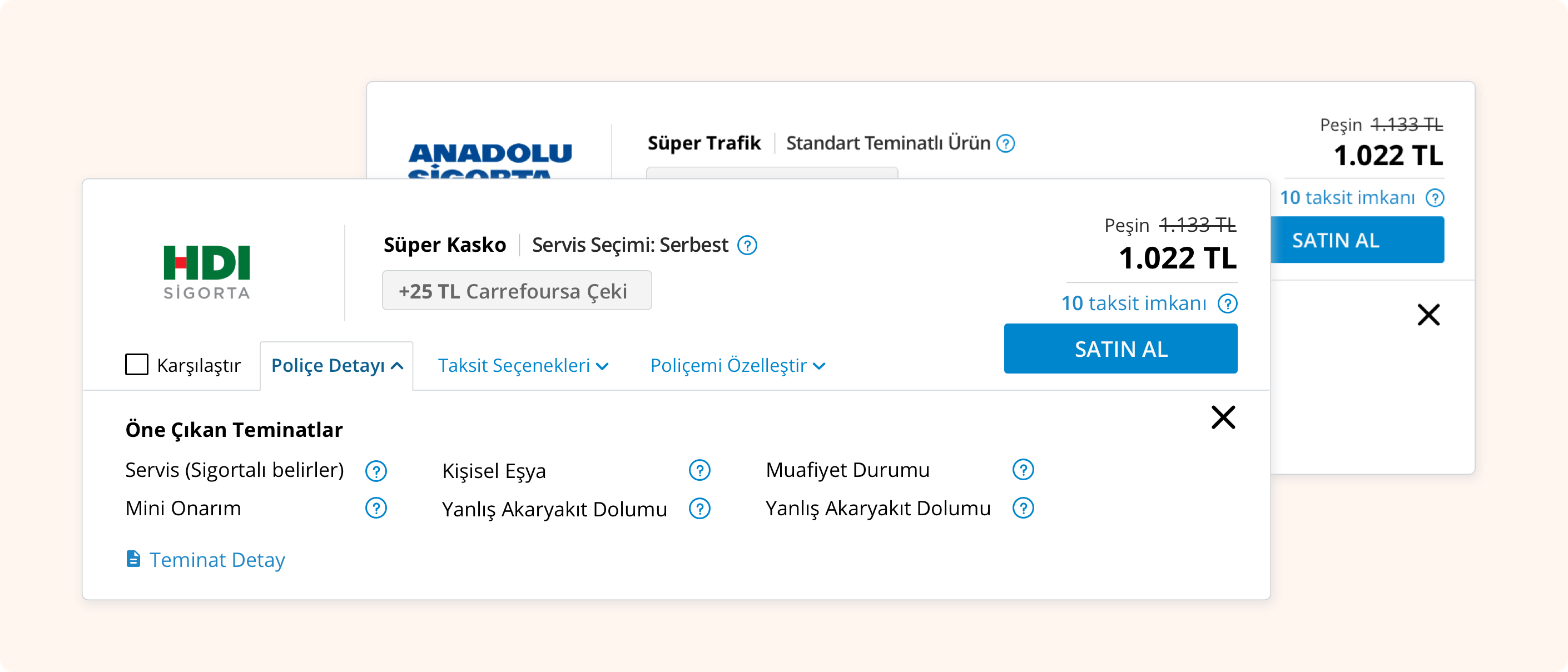
The Policy Details and Installment Options are positioned as tabs. In this way, the cognitive load of the card decreased and moved away from the intense image.
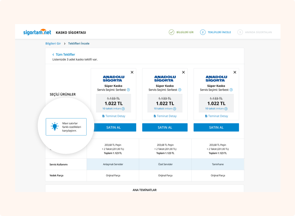
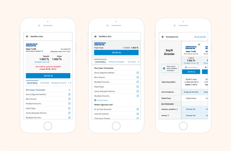
By clicking the products to be compared on the product cards, we can see the products to be compared in the black band at the bottom of the page. In this way, the user can easily recognize the selected products and quickly compare the desired products. Users can easily distinguish the differences of products thanks to the blue lines on the comparison page
There is not much information in the slider due to the lack of space.Navigation elements are in the foreground so that the user can easily reach their needs.
In the old card structure, we could not see an entire card in the first fold. This situation caused more problems on mobile. The design was not made according to design principles such as design balance, hierarchy, space, harmony. Also, the loading elements were very dominant. Because of this, loading seemed more important than the product card.
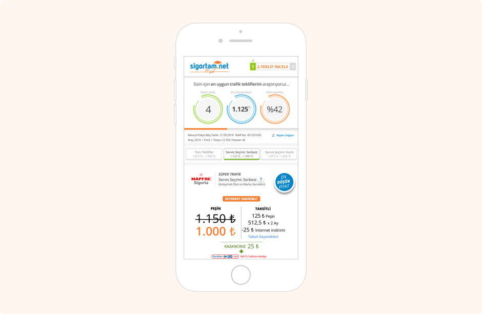
The card heights are not too high on the mobile listing page. In this way, the user can see more product cards on the screen.
The product card with the campaign is in a different color so it can be distinguished from other cards.
Product Detail Page, Product Detail Page- Sticky Toc, Compare Page
Other Projects

