Sigortam.net Redesign
Overview
| My Roles | UX Research, UX Design, UI Design, Prototyping |
| Device | Desktop, Tablet, Mobile |
| Year | March 2019 - May 2020 |
| Client | Sigortam.net |
The client
Aim of Project
Progress
Research
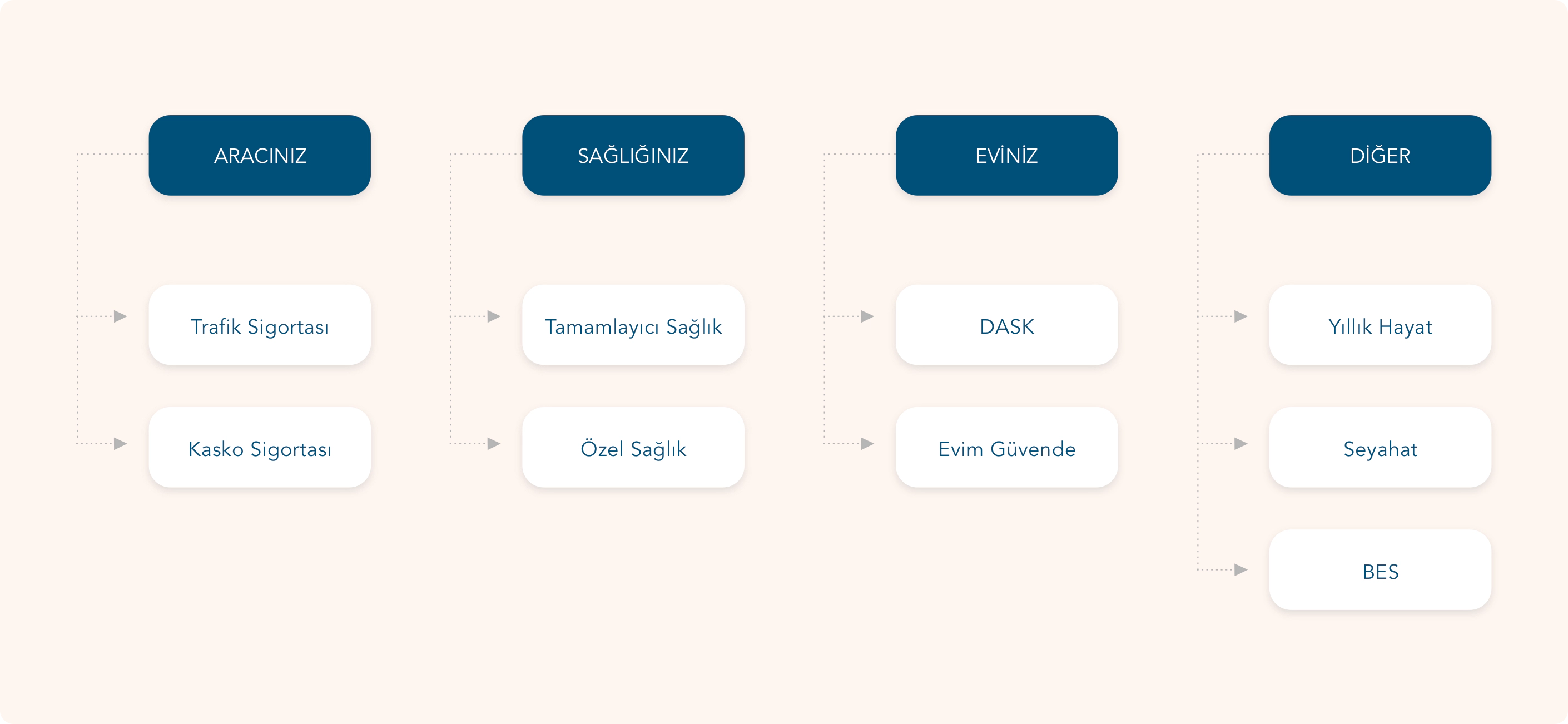
Information Architecture
In the information architecture of the site, the categories were not clear and users were having trouble finding what they were looking for. Users wanted to get insurance for their cars, homes and other needs.
We have reduced the number of categories by classifying these needs.We also named the categories phonetically using a friendly and close language.
Adaptive Design
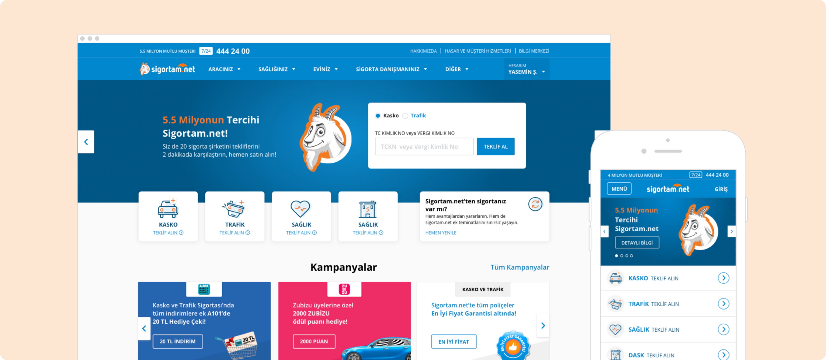
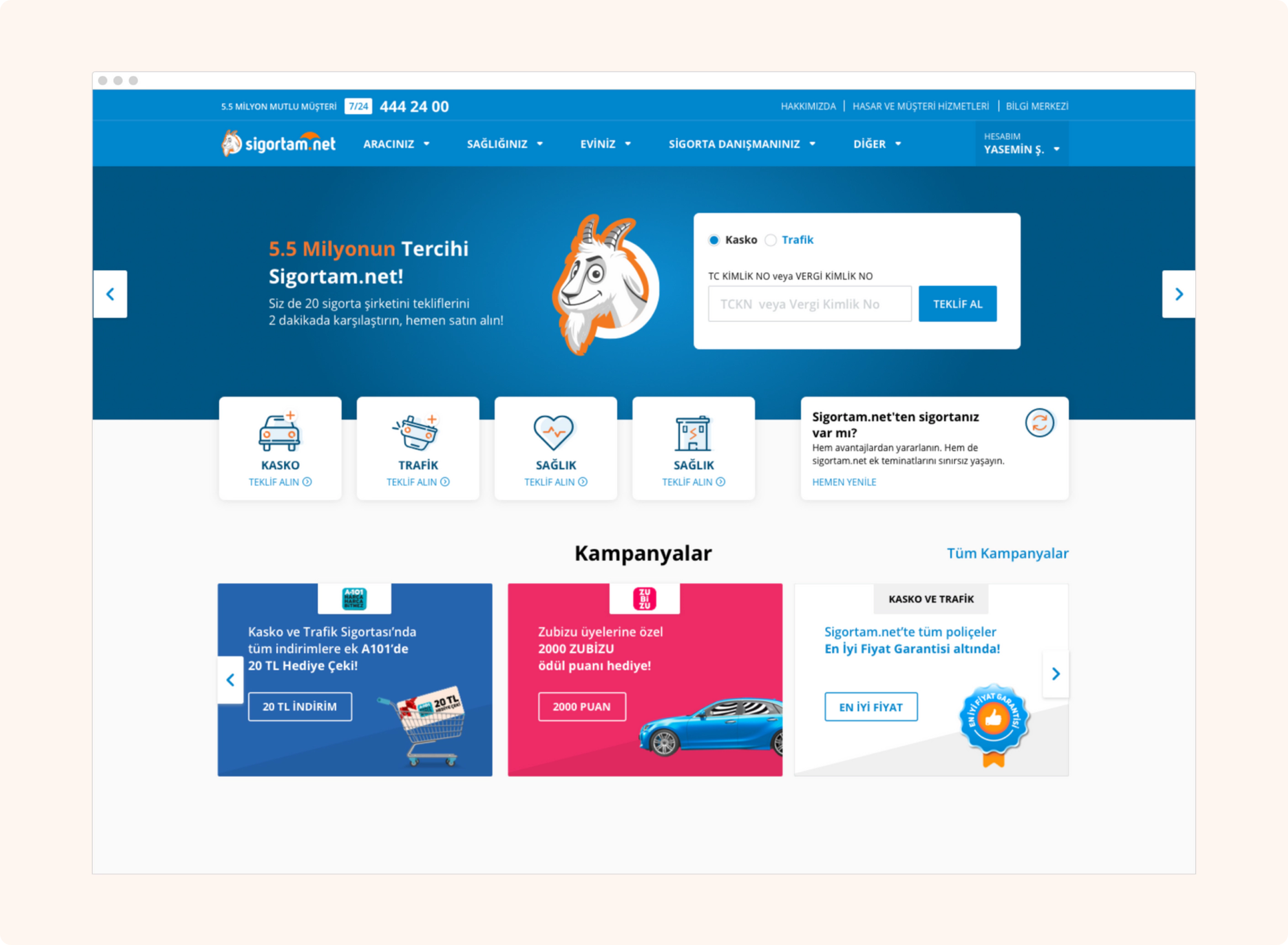
Homepage
Users can get insurance offers, see campaigns, renew their insurance and get information about Sigortam.net through the homepage. Slider was used as a tool to show the latest news on the product, promote the brand, and facilitate the transition to conversion steps.
There are campaigns in the center of Sigortam.net. Therefore, the campaign features were used in the first fold. By standardizing the campaigns, all the layouts were made consistent. This consistency continued in social media and brand communication.
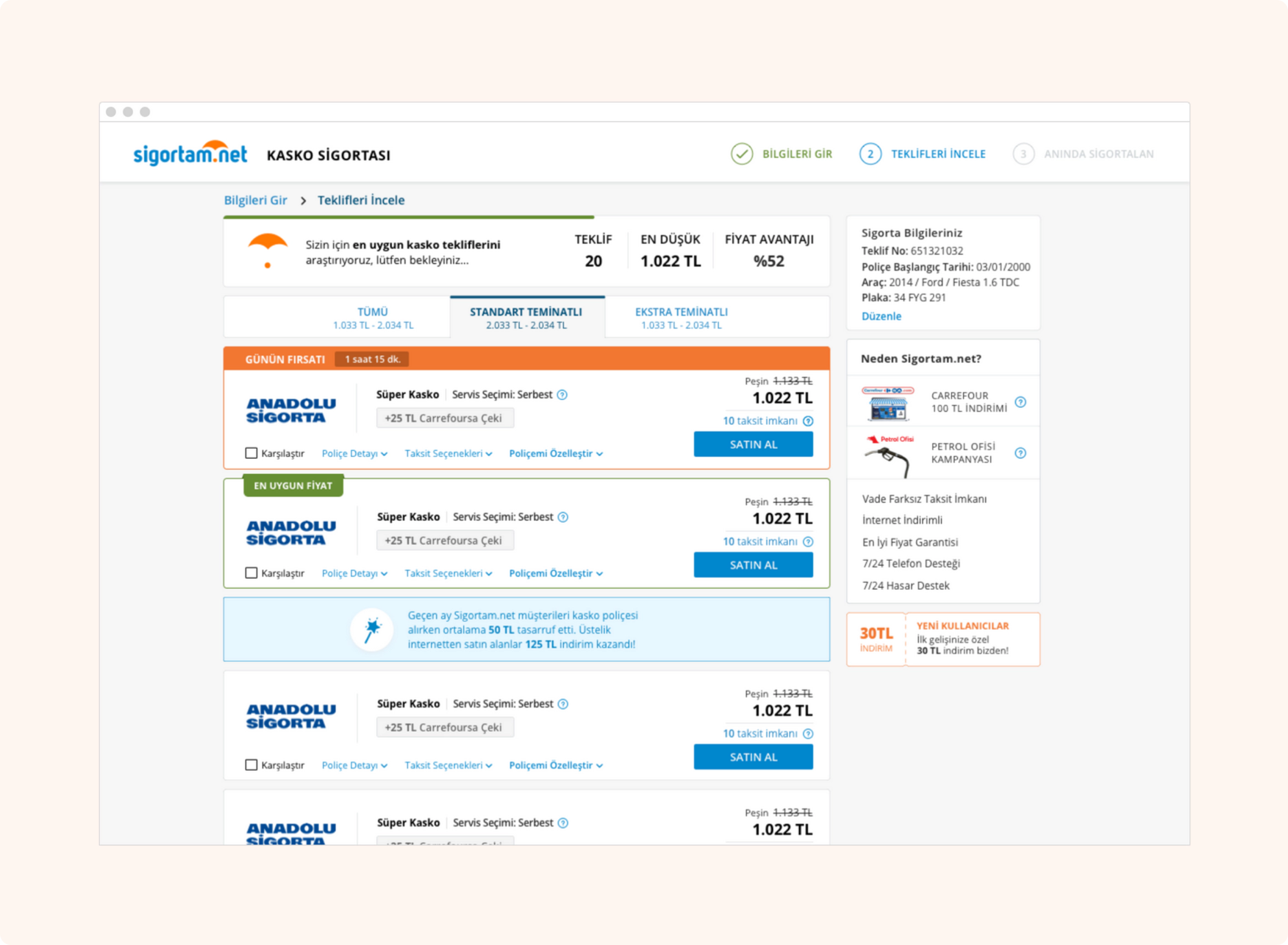
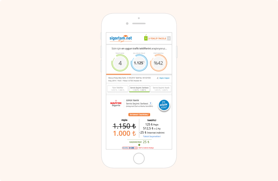
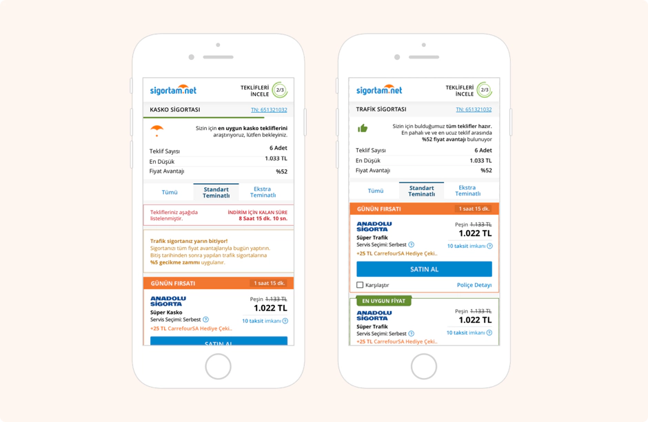
Listing Page
Old Product Cards
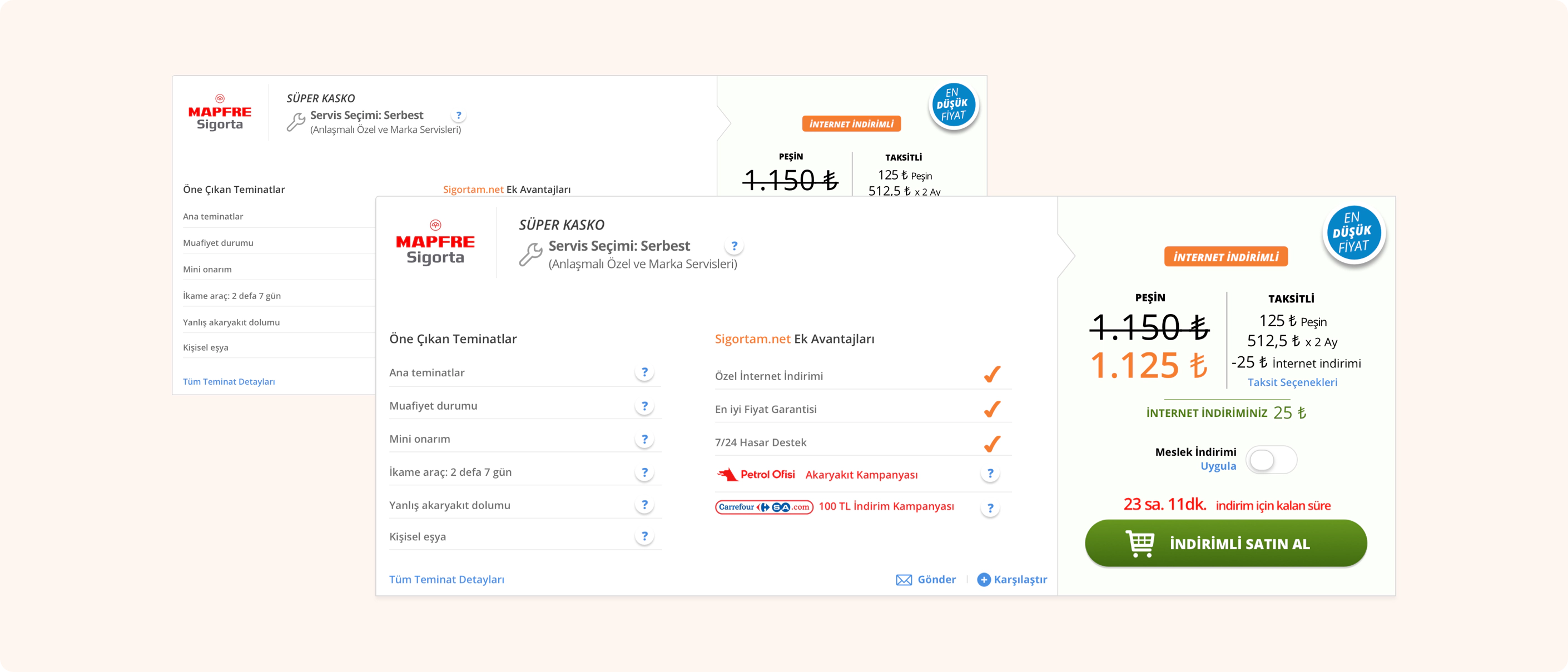
New Product Cards
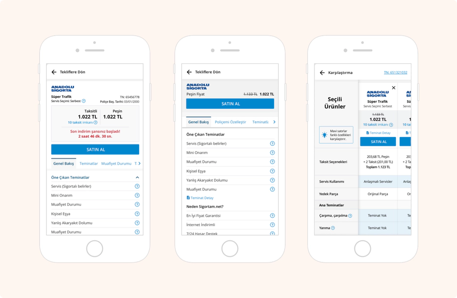
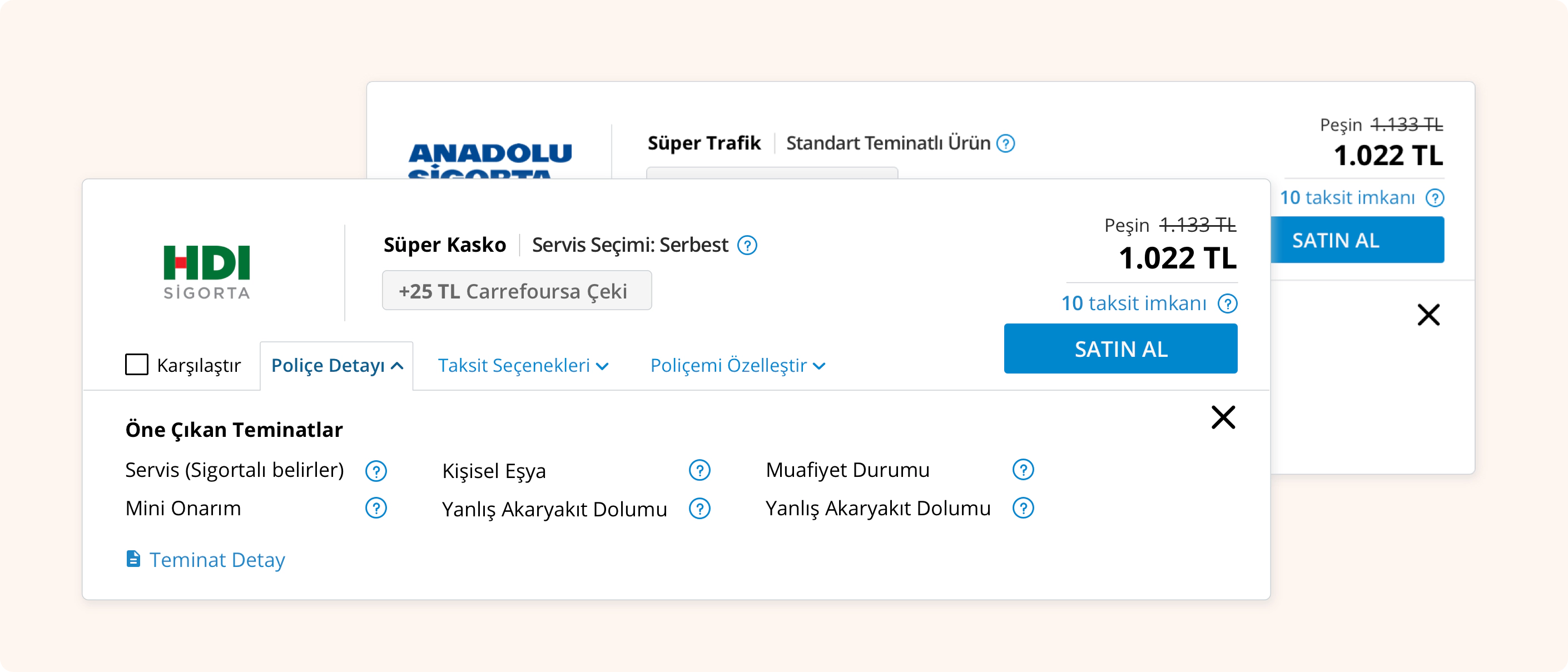
The height of the new product cards has been reduced so that the user can see more offers on the first fold and reach the most suitable.
The Policy Details and Installment Options are positioned as tabs. In this way, the cognitive load of the card decreased and moved away from the intense image.
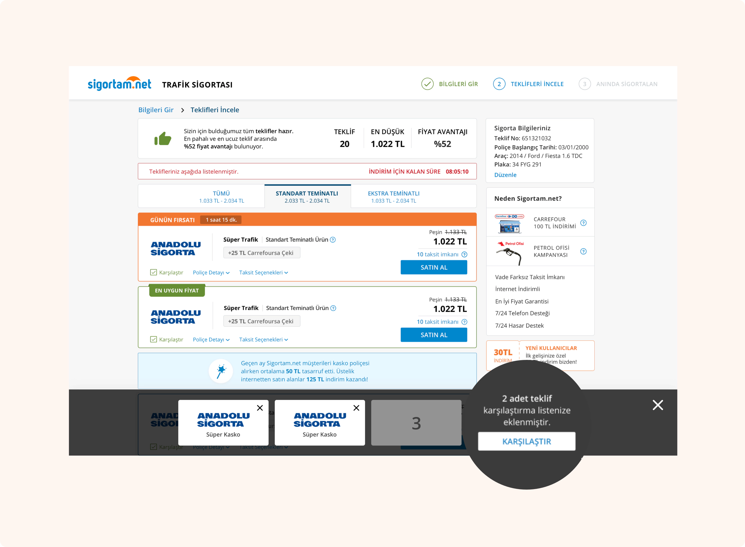
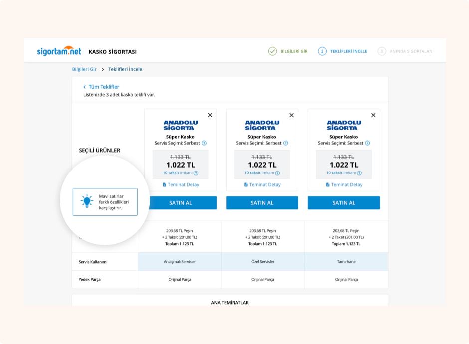
Compare List & Page
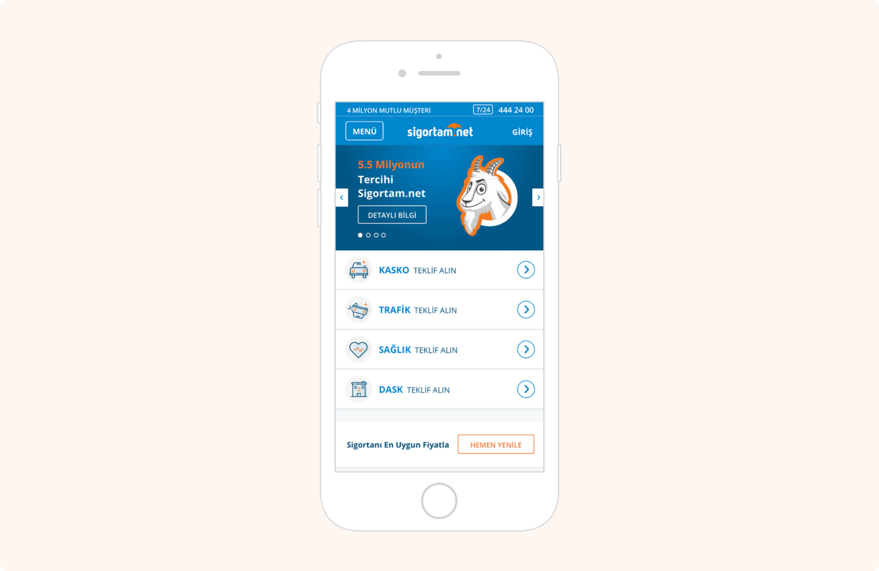
Mobile Homepage
Old Product Cards
New Product Cards
The card heights are not too high on the mobile listing page. In this way, the user can see more product cards on the screen.
The product card with the campaign is in a different color so it can be distinguished from other cards.
Other Screens